GYDMUN
Designing the registration, payment, and participant journey of an international youth Model UN conference, from landing page to selection results.
- Senior Product Designer
- Dealls
- 2025
- Figma

(01) — Overview
One journey, from first click to seat.
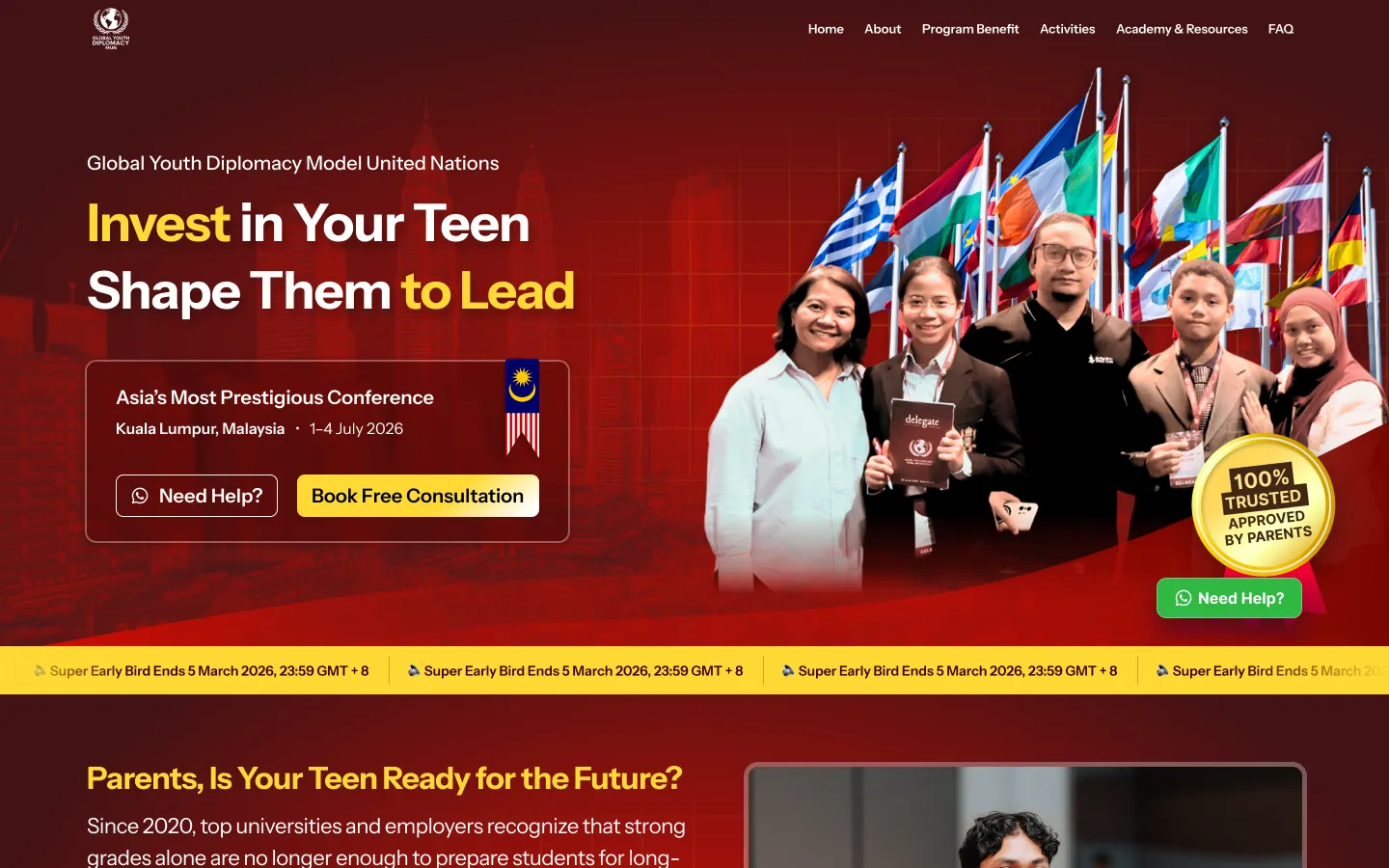
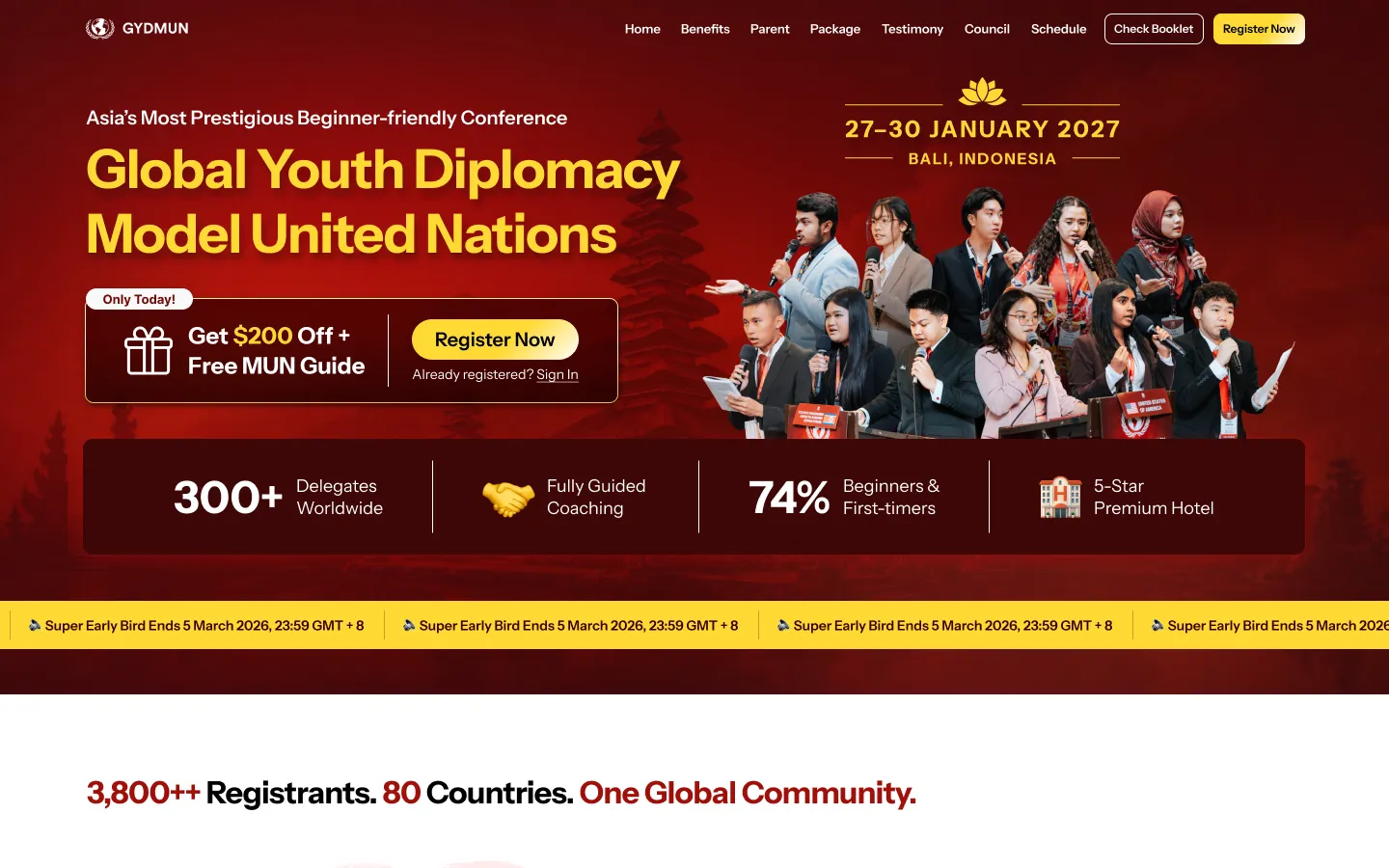
GYDMUN (Global Youth Diplomacy Model United Nations) is an international youth conference in Bali for students aged 11 to 26. I design its digital experience: the landing page, registration and council selection, packages and installment payments, the participant dashboard, and a dedicated page for parents. The goal is simple: help a student, often with a parent involved in the decision, understand the conference, apply, and secure a seat without confusion.
(02) — The problem
A long path to a seat, with two people deciding.
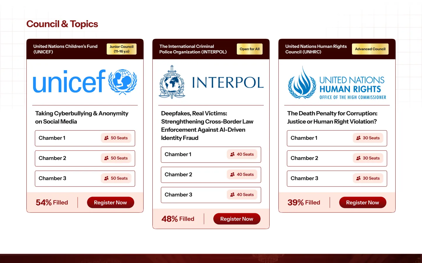
Joining GYDMUN is not a single checkout. A student registers and picks a council, waits for a selection result, chooses a package, pays in full or in installments, then prepares for the conference. Many applicants are minors, so a parent often judges the program and handles the payment, while the student needs to know what to do next. The design challenge was to keep both people informed at every step and keep the path from interest to a confirmed seat short and clear.
(03) — My role
Design, end to end.
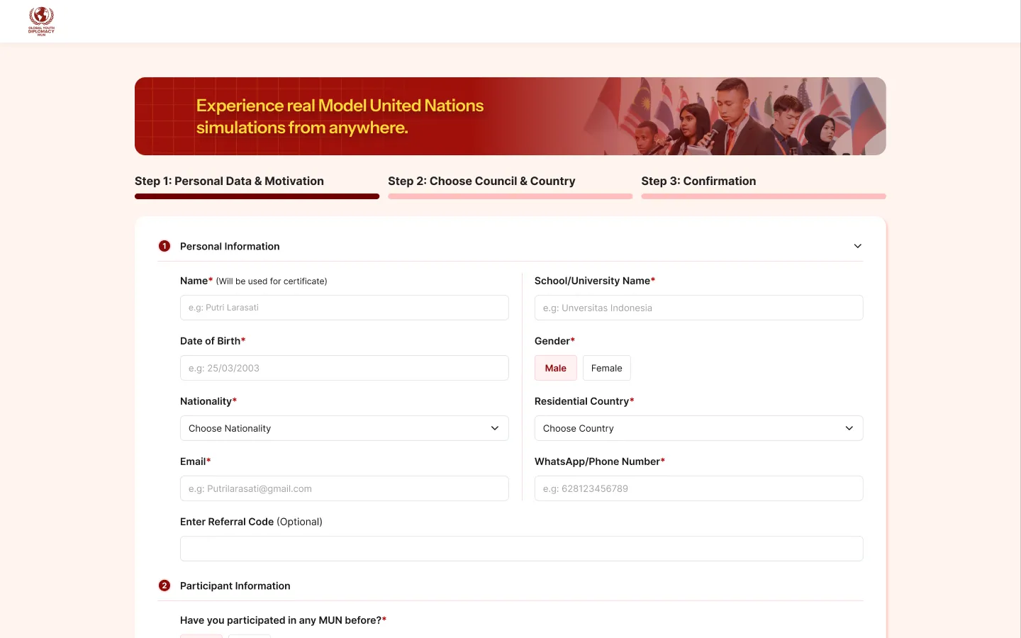
As Senior Product Designer, I designed GYDMUN from the first landing page to the participant dashboard, working in Figma. That covers the user flows, the screens for desktop and mobile, the page states, and later revisions to the registration, council selection, and payment pages. The design lives in a single Figma file with the landing pages, registration, payment, dashboard, and parent pages side by side.
(04) — What I work on
What I work on.
Five areas make up the product, each designed for a different moment in the participant's journey.
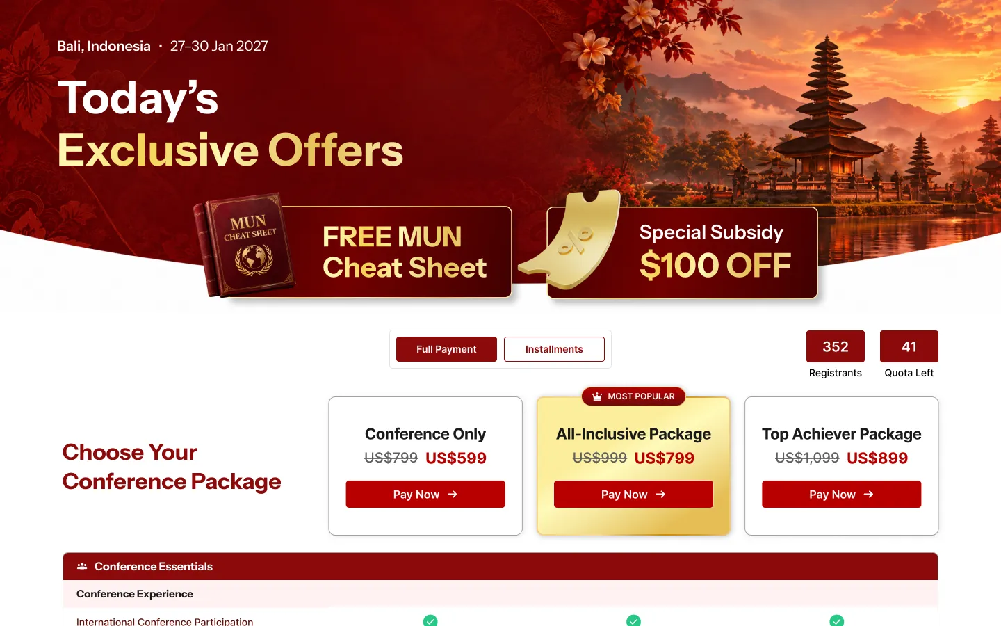
- Landing pages. The long-form pages that explain the conference, its councils, awards, and FAQ, plus a separate Online MUN version.
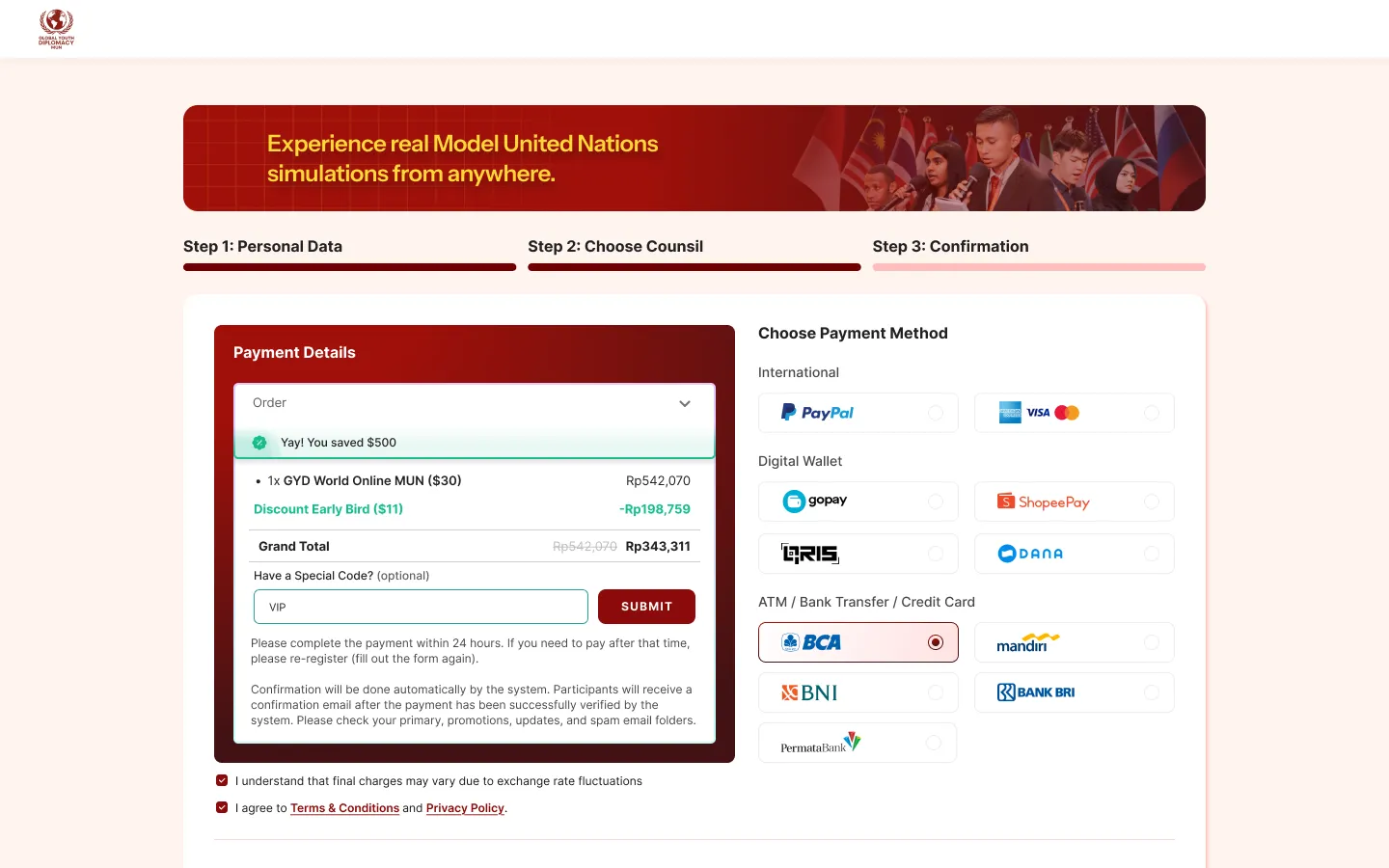
- Registration and council selection. The application form, terms and privacy pages, and the council choice step, refined over several rounds.
- Packages and payments. Package comparison, installment plans, an observer plan, and the payment page with its supported payment methods.
- Participant dashboard. A step-by-step progress view with selection status, document and twibbon upload, and the conference schedule.
- Parent page. A dedicated landing page that speaks to parents: what the program is, how it works, and how to take part as an observer.
(05) — Outcome
A flow that is live and in use.
The landing pages and the registration journey are live at gydmun.org, including registration for the Bali edition in January 2027. The full set of screens, from landing page to participant dashboard and parent page, covers every step a participant takes from first visit to confirmed seat. I do not publish conversion or registration figures here.
(06) — What I learned
What I learned.
Designing for two audiences taught me to give each one its own page instead of making one page serve both: a parent weighing the program needs different answers than a student ready to apply. I also learned that a multi-step flow with payment in the middle needs clear status at every point, so the participant always knows what has happened and what comes next. And with a long path from first visit to confirmed seat, small clarity gains in the registration and payment steps matter more than visual polish on the landing page.